GCB 경기도자비엔날레@@
GCB 2026


- GCB 2026
- Identity (EI / BI)

- GCB 2026
- Identity (EI / BI)
Event Identity (EI)

The Event Identity (EI) of the Gyeonggi Ceramics Biennale 2026 is a visual design system developed to embody the Biennale’s theme, Earth Makes.
This newly created identity presents ceramics not simply as a craft object, but as a material that originates from the earth and connects culture, technology, and the future. It reflects the Biennale’s perspective that clay is a living medium through which humanity and the planet continuously shape one another.
Ceramics are formed through the interaction of earth, water, fire, and time. The EI seeks to translate this process of transformation and the energy of creation into a visual language.
-
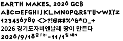
The fluid and ever-changing typography expresses the nature of ceramics as they shrink, warp, and evolve inside the kiln. Like clay itself before and after firing, the thickness and form of the letters are never entirely fixed, revealing the dynamic movement of a living material.
-
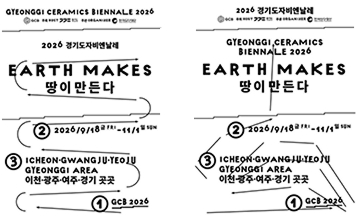
The repeated linear elements evoke the stratification of the earth, the accumulation of time, and the circulation of heat within the kiln. Their stepped arrangement recalls geological layers and the structure of traditional climbing kilns, while directional lines and arrows visualize the flow of energy, connection, and transformation.
-
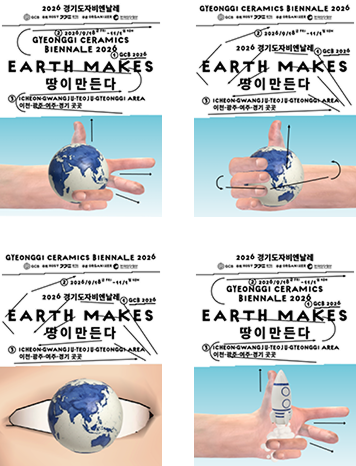
The three directional gestures of the hand featured in the poster are inspired by Fleming’s Right-Hand Rule, symbolizing the generation of new energy through the interaction of different forces. This motif reflects the process by which earth, fire, human senses, and technology come together to create ceramics. At the same time, it alludes to the Biennale’s three host cities—Icheon, Gwangju, and Yeoju—which together form the geographical foundation of the event.
The globe held in the hand does not suggest humanity’s dominion over the planet; rather, it represents a relationship of interconnectedness, coexistence, and collective creation between humans and the Earth. The image of the globe within the eye suggests a way of seeing ceramics not merely as crafted objects, but as a medium through which we reflect upon the planet’s deep time, the environment, human life, and the future. Finally, the rocket motif points toward the future potential of ceramics—demonstrating that this ancient material is not confined to tradition, but can expand into new realms of art, technology, and imagination.
Symbol Mark
심볼마크는 경기도자비엔날레 아이덴티티
디자인의 핵심이 되며 모든 영역에 적용됩니다.
간결하지만 의미심장하게 디자인 된 심볼마크는
커뮤니케이션의 대상에게 경기도자비엔날레의
아이덴티티를 빠르고 효과적으로 전달하는 역할을
합니다.
심볼마크는 로고타입과 결합하여 사용하는 것이
기본이지만 심볼마크와 로고타입을 분리해서
사용하거나 심볼마크만을 독립적으로 사용할 수도
있습니다.